Website Research: Samantha Evans & Adam Fontana
I am creating my own Acting portfolio website this term, therefore I will compare two different examples of other actor's websites. I will have a look at them from both sides as a user and as an actor to see how convenient it is to use the website or what ideas can I think of during a creation of my own website. This website research will assist me in understanding how to create my own website so I will consider the overall design, colours, and typography, navigation, usability/user-friendliness, links and mobile view.
The first website I will analyze is Samantha Evans Website. I will begin with homepage design which is quite minimalistic. I think it could have some another colour of the background. However, the text colours are bright which attracts my attention. The font of the text is also interesting and authentic. We can see clearly actor's name positioned in the centre and her specialism underneath which is good to have an idea whose website I am visiting. She also united it with About page, so she has the information about her on Home Page. I don't like the way how biography is written because I don't see there something special except for just general information about the artist. However, there are social links in the bottom and I also checked them.


When it comes to Gallery/Headshots page, I noticed that she has quite similar pictures of her where she just smiles which is a bit weird for an actor. It doesn't give an idea of her diversity in different roles. I think there is no reason to put many photos on the website if they are the same. Instead, you can put the pictures of yourself in different emotions.


I also checked mobile version of the website and it was quite the same with the same background and filling. The only difference was in navigation bar and it looks different as it isn't much space on mobile version.
In overall, I would say that everything is consistent on her website and easy to find, so it was a good experience of using it. However, I think the navigation could be better by adding some buttons to other pages. In addition, I find the design quite boring because it is the same white background on each page which doesn't really attract attention. But the main point which I found the most important and working is her portfolio and the amount of works on Media Page.
The next website I looked at is Adam Fontana Website. I will begin with the Home page which shows the photo of him, name and says about his specialism - actor photographer.


The first website I will analyze is Samantha Evans Website. I will begin with homepage design which is quite minimalistic. I think it could have some another colour of the background. However, the text colours are bright which attracts my attention. The font of the text is also interesting and authentic. We can see clearly actor's name positioned in the centre and her specialism underneath which is good to have an idea whose website I am visiting. She also united it with About page, so she has the information about her on Home Page. I don't like the way how biography is written because I don't see there something special except for just general information about the artist. However, there are social links in the bottom and I also checked them.


However, the navigation bar is good because it is well seen and it is positioned in the centre. It is also clear and easy to find the information.

Then I went onto the Resume Page where I found her actual acting resume and buttons with the links on her profiles which are useful and work well on the audience. However, this page seems to be a bit boring without any pictures.

The next page was Media and I really liked it. Here I found many acting works in from different projects. As for me, it greatly showcases the actor and works as a very good portfolio. The only thing missing is the description of these videos which I think are important to make people want to see it.


The contact page is good looking. It also contains important information with contacts of agencies where she works. I liked that she included the picture of her on contact page.

The last page was about her coaching and ways how to contact her if people are interested in private drama classes.

The background go the page is light grey and the same has his photo, just a bit darker. However, it is fits the page and looks very organic in my opinion. I like the design of the page. The only thing I would change is to add the button on About Page. There are also links on social media at the top of the page which is even more attractive and easily seen. But I didn't find a copyright sign which is quite strange. The text is white which is clearly seen and the font is also interesting and differs from others.

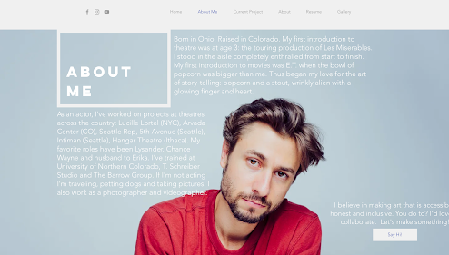
The next page is About Me, it is located in the navigation bar at the top which makes it easy to find. Here is a picture of the artist followed by his biography around and a quote by another artist. I found the position of the text and the biography very interesting in the design.

The third page is his Current Project which con taint the shoots from a project and names of works where he takes part at the moment. In my opinion it is quite useful and easy to identify the artist in such way. It also shows the genres or types of movies/performances in which he works.

The Resume Page has a button where you can download acting resume and there are also sections in different areas which show the experience. The design of the buttons matches the website in general and they look really professional.

If you scroll down you will find gallery and acting portfolio (showreel).

Unlikely the first website, here we can see different photos of the actor including portraits, studio photos, performances and cinema.

Contact Page contains the form, photo of the actor, his email and links to the social media.

I also found one more About Page which also has the photo and biography on it. I found the photo really interesting and catching attention however I don't understand what is this page for. It also contains the button which leads to the first About me Page.

I checked mobile version and it looks very good. It differs from the desktop one in About me page. Because there is only one About Me Page in mobile version. However, it is very easy to navigate, use it and the design is pleasant. All items and pages placed nicely, following each other when scrolling down.
In general, I liked using it and I would definitely recommend it to others and visit it by myself again.
After comparing two websites, I would say the first one was quite boring in the design and amount of information. As for me, the website doesn't open the artist as it should be. The only thing which is really great is portfolio and acting works. If I think about my own website, I would make the background different on each page, I wouldn't't pick different colour but perhaps put my own picture there. I also want to choose more interesting colours not to make it simple such as black or white. I would also make more interesting biography as it was in the second website. Because Adam's one attracted me more as it gave more information about his as a personality. Both websites were consistent in their design however I found more filled and interesting in the second one. Also, Adam's website showcases him better as an actor through the biography, gallery and portfolio. I liked his idea of positioning social media links to make them easier to find.
The mobile view on Adam's website was much interesting and better in the design and navigation. All was very well placed while Samantha's one was very simple. I also took the idea not to forget about mobile view and work on it separately as it can be completely different and it is more important to make UZ Testing of the website to make sure everything works properly.
It was a great experience to get an idea of what I wand and what I don't want to have on my website. Comparing something or researching always leads to new ideas and plans. It is very important for me that people find my website pleasant and easy to use so they will come back in the future or cooperate with me.


Comments
Post a Comment